Websites · August 4, 2026
The treatment center website that turns visits into calls

By Zac Spencer
The visitor you're building for
Picture who is on your website at 1:40 on a Tuesday morning. A mother who found pills in her son's room. A husband reading "signs of alcoholism" articles in the dark next to a sleeping spouse. Someone four days sober and scared it won't hold. They are exhausted, frightened, and holding a phone.
A treatment center website has one job with that visitor: make calling feel safe, and make it easy. Everything else on the site, the program pages, the photos, the insurance information, either moves someone toward that call or gets in the way of it. Most treatment center websites we audit have plenty of content and very little of what a person in crisis needs in the first ninety seconds. This post covers what needs to be there, in roughly the order a family looks for it.
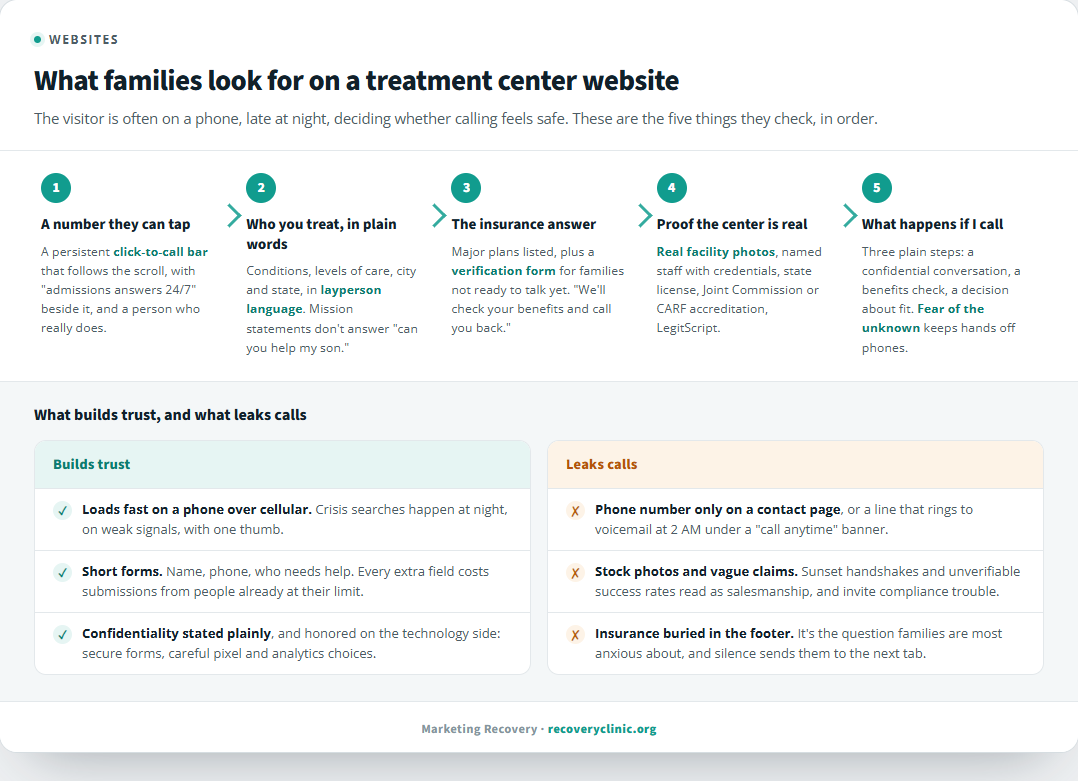
The elements of a treatment center website that families look for before they call, in the order they look for them.
A phone number that is always one tap away
The single most expensive mistake on treatment center websites is a phone number that lives only in the header of the desktop layout, or worse, on a contact page. The visitor is on a phone. The number should sit in a persistent bar that stays visible as they scroll, and it should be a click-to-call link, not text they have to memorize and dial.
Next to that number, say what happens when they call. "Admissions answers 24/7" or "Speak with someone tonight" removes the fear of ringing into a voicemail at 2 AM. And it has to be true. If the line is only staffed business hours, either fix the coverage or say when a person answers, because a crisis call that hits voicemail usually goes to the next center on the list. One treatment center we worked with grew from almost no tracked calls to more than 300 a month, and a persistent, honest call bar was one of the first changes made. If you don't have call tracking running, you won't know what your site is producing in the first place.
Answers to the three questions every family has
Families arrive with the same three questions: do you treat what my person has, do you take my insurance, and what happens if I call. A converting site answers all three without making anyone dig.
The first one is about plain language on the homepage. Name the conditions you treat and the levels of care you offer, in words a layperson uses, with the city and state visible. "Medical detox and residential treatment in Scottsdale, Arizona" beats a paragraph of mission statement every time.
Insurance is the question families are often most anxious about, and it deserves its own prominent block, not a logo strip buried in the footer. List the major plans you accept and give people a low-pressure way to check coverage before they commit to a conversation. An insurance verification form does real work here: some families genuinely are not ready to talk yet, and a form that says "we'll check your benefits and call you back" captures the ones a phone-only site loses.
The third question, what happens if I call, is answered with a short "what to expect" section. Three or four plain steps: a confidential conversation, a benefits check, a same-day decision about fit. Fear of the unknown keeps hands off phones, and a paragraph can remove most of it.
What a treatment center website has to prove
Treatment is a field where families have learned to be suspicious, and they are right to be. Your website has to prove legitimacy fast, and the proof has to be specific.
Real photos of your actual facility, inside and out, do more than any stock image of a sunset handshake. Staff pages with names, faces, and credentials tell a family who will be caring for their person. State licensing, accreditation from The Joint Commission or CARF, and LegitScript certification belong where people can see them, with the certificate numbers or verifiable links rather than just badge graphics. A center's Google Business Profile and reviews get checked in a second tab while they're on your site, so the story has to match in both places.
What doesn't belong: outcome claims and success-rate statistics you can't substantiate, "guaranteed recovery" language, or anything that reads like it was written for search engines instead of a frightened parent. Beyond being a compliance problem for your license and your ad accounts, it reads as salesmanship in a moment when families are scanning for sincerity.
Speed and mobile come before beauty
Crisis searches happen on phones, at night, often on a weak signal in a hallway or a parked car. A site that takes eight seconds to load loses a meaningful share of those visitors before it ever gets a chance to convert them, and no redesign budget fixes that if the pages stay heavy.
Test your site on a real phone over cellular; the office wifi hides the problem. The number should be tappable immediately, the text readable without zooming, and the insurance form usable with one thumb. Mobile speed also feeds your rankings, which is where the visitor came from in the first place; the same fundamentals that make a site convert are the ones behind SEO for treatment centers doing its job.
Forms that respect what people are going through
Every field you add to a form costs you submissions, and the people filling out treatment forms are already at the edge of what they can manage. Name, phone number, and who they're seeking help for is enough to start a conversation. The rest belongs in the phone call.
Say clearly that the conversation is confidential, and handle what people submit accordingly. Health information deserves careful treatment on the technology side too, which means secure forms and being deliberate about what your analytics and advertising pixels can see on pages where people disclose sensitive things. Your compliance officer should be part of that conversation; your marketing team shouldn't be making those calls alone.
The website is your night-shift admissions staff
An admissions coordinator would never answer a mother's question about insurance with silence, or respond to "do you treat fentanyl addiction" by reciting a mission statement. A website that does either is failing at the same job, at the hour when most of the reaching-out happens.
Our website work for treatment centers starts with exactly this audit: where the calls are leaking, and which of these elements are missing or buried. If you want that read on your own site, request a free audit and we'll go through it page by page, phone in hand, the way a family would.
About the author
Zac Spencer is an online marketing specialist and the owner of Crave Media, based in Salt Lake City, Utah. Since 2013 he has managed hundreds of Google Ads accounts across dozens of industries, and founded Marketing Recovery, a specialized arm of Crave Media focused on marketing for licensed addiction treatment centers.