Websites · July 24, 2026
Where insurance verification fits your admissions funnel

By Zac Spencer
Two kinds of families land on a treatment center website. The first is in crisis right now. They want a phone number, and every page should hand them one. The second group is further back in the process: researching options at midnight, quietly carrying the question that stops many admissions before they start. Will insurance cover this?
That second group rarely calls. Calling means saying things out loud they may not be ready to say, to a stranger, about someone they love. So they keep browsing, and if your site gives them nothing to do except "Call now," many of them leave and keep looking. An insurance verification form is how you catch them. It does a job the phone number can't, and where you put it in your admissions funnel decides how well it works.
The question behind most abandoned admissions
Treatment is expensive and families know it. Residential care can run tens of thousands of dollars, and the fear of a bill that size makes cost the first practical question a family researches, often before they've compared a single clinical program.
The phone call can answer that question, but only for people willing to make the call. For everyone else, the cost question just sits there, unanswered, while they scroll. A verification form gives that family a low-commitment next step: share your insurance details, and we'll tell you what your plan covers. No conversation required, and the scariest unknown in the whole process starts getting answered.
For the center, the form does something else. It turns an anonymous visitor into a family you can help. Someone who submits a verification form has told you who they are, what plan they carry, and that they're seriously considering treatment. In a niche where clicks can cost $25 to $150 and an admission can cost $6,000 to $10,000 to acquire through ads, letting research-stage visitors leave with no next step is expensive.
Two doors into the same funnel
The way we think about it, a treatment center website needs two front doors that lead to the same admissions team.
The first door is the phone number, for the family in crisis. It belongs in the header of every page, big and tappable, with call tracking behind it so you know which marketing made it ring. We covered that in our post on call tracking for treatment centers.
The second door is the verification form, for the family that isn't ready to talk. It converts the researcher, the spouse gathering information before a hard conversation. Neither door replaces the other. A site with only a phone number loses the researchers; a site that buries its number behind forms fails the family in crisis. The two doors work different shifts.
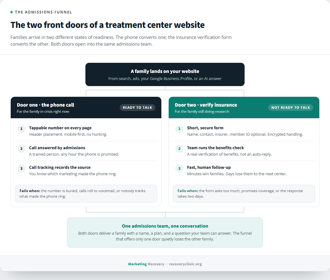
The two front doors of a treatment center website. The phone converts the family in crisis; the verification form converts the family still doing research. Both feed the same admissions process.
Where the form belongs on your site
Placement is mostly about meeting the visitor at the moment the cost question surfaces.
Give verification its own page, something like /verify-insurance, and put a link to it in your main navigation. Families look for it there, and a dedicated page gives your ads and your Google Business Profile somewhere specific to send cost-focused traffic.
Then put a short verification block on your admissions page, because that page's whole job is removing barriers, and cost is the biggest one. We wrote about why ad traffic should land on your admissions page instead of your homepage, and the verification option is a big part of what makes that page convert: it catches the click that was never going to call.
Program pages deserve a lighter touch, a simple "Wondering if insurance covers treatment? Verify your benefits" link near the bottom. The family reading your residential program page at 1 AM has the cost question open in a mental tab. Answer it where they're standing instead of hoping they find the right page later.
Keeping the form short and the follow-up fast
A verification form fails two ways: asking too much, or answering too slow.
Keep the fields to what your admissions team needs to run a benefits check. Name, phone or email, insurance provider, and member ID, with the ID optional if you can manage it, since some families won't have the card in hand at midnight. Every extra field costs you submissions from people who were one hesitation away from leaving anyway.
Then treat the submission with the urgency it deserves. A verification request is a family standing in your doorway. If your team responds in fifteen minutes, you're likely the first center that treated their question like it mattered. If the response comes in two days, they've already talked to someone else. In our experience, response speed on verification requests tracks closely with how many of them become admissions, which makes it worth staffing deliberately rather than treating it as paperwork.
One compliance note: these forms collect health-adjacent information, so they need to be handled accordingly. Submissions should travel encrypted to a secure inbox or CRM, never to a shared email half the staff can read on their phones, and your privacy policy should say plainly what happens to the information. And the form should promise a benefits check, not coverage. What a plan pays is the insurer's call, and your site should never imply otherwise.
What this means for the rest of the funnel
Once the verification path exists, the rest of your marketing gets more efficient, because every channel gains a second way to convert.
Your Google Ads can speak to cost anxiety directly instead of dancing around it. Your SEO content about insurance and treatment costs has somewhere useful to point. Even your cost per admission math improves, since the same ad spend now captures families the call-only funnel silently dropped.
A treatment center website has one real job: make it as easy as possible for a family to take the next step, whatever step they're ready for. That's the standard we build to in our website work for treatment centers, where the verification path is part of the architecture from day one rather than a form bolted on later.
If you're not sure whether your current site is catching the researching family or losing them to the next tab, send it over for a free audit. We'll show you where the funnel leaks, and what catching those families would change.
About the author
Zac Spencer is an online marketing specialist and the owner of Crave Media, based in Salt Lake City, Utah. Since 2013 he has managed hundreds of Google Ads accounts across dozens of industries, and founded Marketing Recovery, a specialized arm of Crave Media focused on marketing for licensed addiction treatment centers.